Most visitors are on a phone. Is your site ready?
If your website was designed on a laptop and never seriously tested on a phone, most of the people trying to find you are getting a broken experience right now.
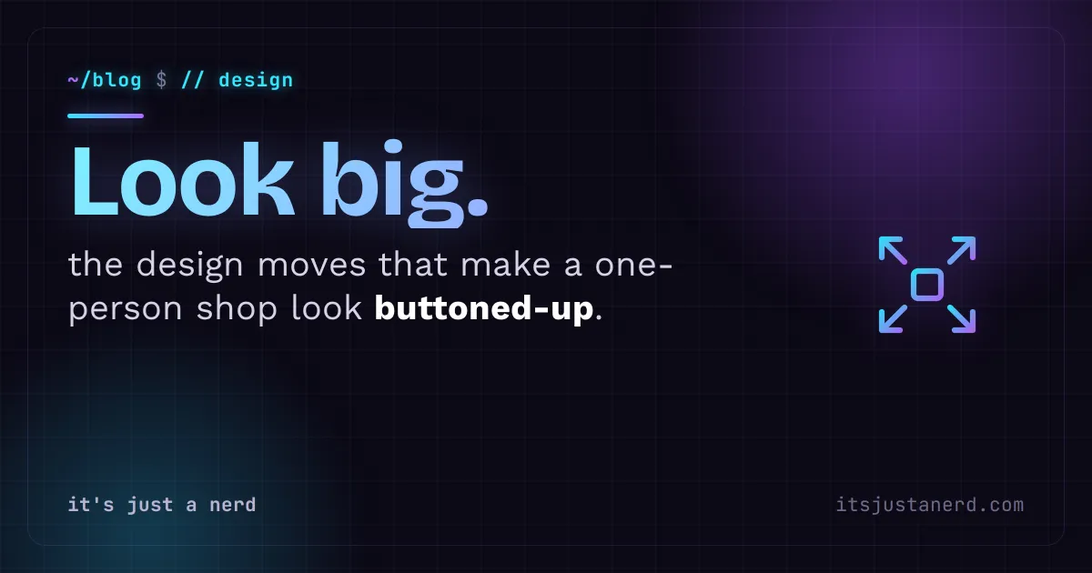
Read it →The design moves that make a one-person shop look like it has its act together, without pretending to be something it is not.
People will decide whether to trust you in about 7 seconds on your website. Not because they read your about page. Because it felt right, or it didn't. That feeling comes almost entirely from design.
Here's the thing: looking credible and looking big are not the same thing. You don't need a team of 40. You need a site that doesn't apologize for existing.
The fastest way to look like you threw something together is to have three fonts, two shades of blue that almost match, and a logo that shows up at a different size on every page. That is not a budget problem. It is a decision problem.
Pick two fonts. Pick a small set of colors and actually stick to them. Make sure your logo looks the same whether it is on your site, your invoice, or your email signature. This is called a brand system, and it sounds fancier than it is. It is basically just deciding what your stuff looks like and then not changing your mind every week.
Consistency signals that someone is paying attention. And if you are paying attention to how you look, clients assume you will pay attention to the work.
A lot of solo operators use vague, corporate language to sound bigger. "We provide best-in-class solutions." Nobody says that. It does not mean anything, and it reads like you are hiding something.
Specific, plain writing does the opposite. "I build booking systems for solo therapists that cut no-show rates by about 38%." That is a sentence. It tells me what you do, who you do it for, and why it matters. I do not care if it is one person or fifteen. I care if you can help me.
If your website is full of "we" and "our" and you are a one-person shop, try switching to "I" and "my." It is not a weakness. It is a differentiator. Clients who hire a solo operator want the person, not the brand voice of a company that does not exist.
Stock photos of people shaking hands in a glass office. You have seen them 10,000 times. They say nothing except "I did not think about this part." Real photos of your actual work, your actual space, even your actual face, are worth more than any premium stock subscription.
If you cannot do photography right now, simple and clean beats busy and fake. A white background. Good typography. Your real logo. That is it. A cluttered, visually inconsistent site scares people off faster than a plain one ever will.
One good photo of you working, one of a finished project, one of a client you have permission to show. That is enough to feel real.
Maria runs a one-woman bookkeeping practice in Phoenix. Her old site looked like it was made in 2014 because it was. Clip-art dividers, a phone number in Comic Sans (yes, really), and a homepage that said "We offer a full range of financial services" without mentioning that she specializes in small restaurants. After a redesign with two fonts, a consistent warm color palette, a real photo of her at her desk, and copy that said exactly who she works with and what they stop worrying about, her inquiry rate went up noticeably. More importantly, the inquiries were from the right people. A chef who found her said "your site felt like talking to a person, not a company." That is the whole game.
There are a handful of small things that communicate credibility without you saying a word about it. Most of them are free or close to it.
None of these require a marketing department. They require about 11 days of focused attention, or a few weeks of slower work on the side.
You do not need a "team" page with stock photos and invented names. You do not need to hide that it is just you. You do not need an office address if you work from home. Clients who want a massive agency are not your clients, and pretending to be one will attract the wrong people and disappoint them anyway.
What you need is to be clearly, specifically, honestly yourself, and to look like you take it seriously. A site that was "good enough" two years ago is costing you real business right now. Not dramatically, not all at once. Just quietly, every time someone lands on it and leaves.
And once your site looks the part, keep it working. Most people finding you are on a phone, so a site that looks polished on desktop but falls apart on mobile is only half the job. A focused redesign can pay for itself faster than most people expect.
The goal is not to look like Apple. It is to look like someone who knows what they are doing and cares about the work. That is achievable. It is also, honestly, what most clients are actually looking for.
If you are not sure whether your site is helping or hurting, tell me what you have and I will give you a straight answer.
No. It usually helps. Clients who hire a solo operator want the actual person. Hiding that with corporate 'we' language makes you sound like a company that does not exist, which is more unsettling than honest.
Get a domain email address. yourname@yourbusiness.com costs around $6 a month and the credibility bump is immediate. It signals that you take your business seriously in a way a Gmail address simply does not.
Professional photos help, but they are not required. One real photo of you at your desk beats a hundred stock images of strangers shaking hands. Simple and honest always beats polished and fake.
Tell me what you're dealing with, an old site, a slow one, an app idea or a task eating your week. I'll reply myself, usually within a day.
Start a project → Design
If your website was designed on a laptop and never seriously tested on a phone, most of the people trying to find you are getting a broken experience right now.
Read it → Design
If your site does more than two of these things, it is quietly turning away people who were already interested.
Read it → Design
A real case study: a six-year-old bakery site with a broken form, a 4 MB homepage photo, and a PDF menu from 2019 was quietly turning away paying customers every day.
Read it →